Result
Before diving into the tutorial, let’s take a quick look at the final result that you’ll be able to create for free after you will have downloaded Wallaboard.
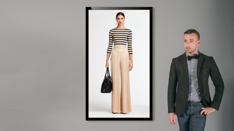
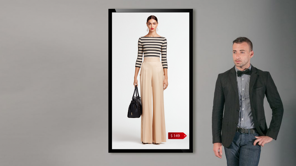
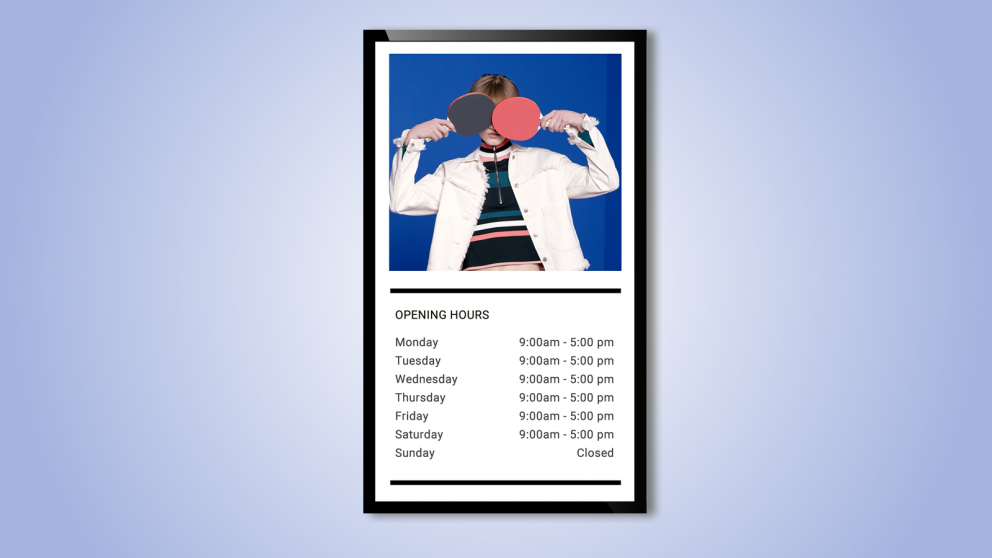
In this example we use the Wallaboard playlist function to alternate 3 different layouts. Each one of these layouts shows how to use digital signage to highlight your clothes collection.
=======================================================
FIGURE 1
Using Wallaboard and Woocommerce in your clothes shop
=======================================================
One step backwards: when using portrait?
Portrait mode is perfect when you want to show a model while wearing a full dress. This choice is perfect if you’re willing to communicate the mood of your newest collection, while adding only a few more details (like model name, the designer or the sku).
Portrait mode has another important characteristic: It looks great! As technology advances, vertically arranged monitors look more and more like pictures than dusty plastic pieces.

Carousel
If you want to show a huge collection, with so many variants and different combinations, you should consider an endless-stripe-carousel as an option for displaying products.
This solution is really easy to be implemented, but still guarantees an eye-catching result. Thanks to carouselv, your leads will be inspired to search for their favourite dress.
When using carousel, you should pay attention on the pictures’ sequence. You can create stripes based on chromatic similarity, collection, usage (i.e. daily, office, hangout).
Once again, the focus here is on image first, and then on minor details, like the price.
Lookbooks
What you probably know is that a lookbook is a set of photographs displaying a fashion designer’s new collection, assembled for marketing purposes. What maybe you don’t know is that lookbook is a great way to upsell when they are shown inside a store.
Indeed, while people are visiting your shop, you can inspire them with stunning example of ready-to-wear combinations of your clothes. If you base your digital signage project on a portrait-view set of monitors, you can display extra information (such as the price of every single piece) in one single column, leaving the big picture in one side of the picture.

Adv
Portrait mode is awesome if you have campaign recorded in 9:16 ratio. When your clients sit in front of such a type of adv, they literally fall into the frame. At the same time, producing a vertical video is not that simple. If you don’t have a suitable video for this kind of usage, you can split a layout in two regions.
One region will be squared (let’s say 9:9) while the second one will be 9:7.
Yes, the second region has a super-custom size, but it is still perfect if you want to add more details to each screen (such as opening hours of your shop, or other background information.).
